Let's talk about lighting.
Lighting is very important in your map. I would say it affects probably every aspect of your map, from mood to playability to how well it is received among the general public. Lighting is a big deal and is not to be taken lightly (har har). Light leads players to points of interest (capture points, health, alternate routes). Brighter light makes identifying other players or items easier.
Let's look at some pictures of Dustbowl.
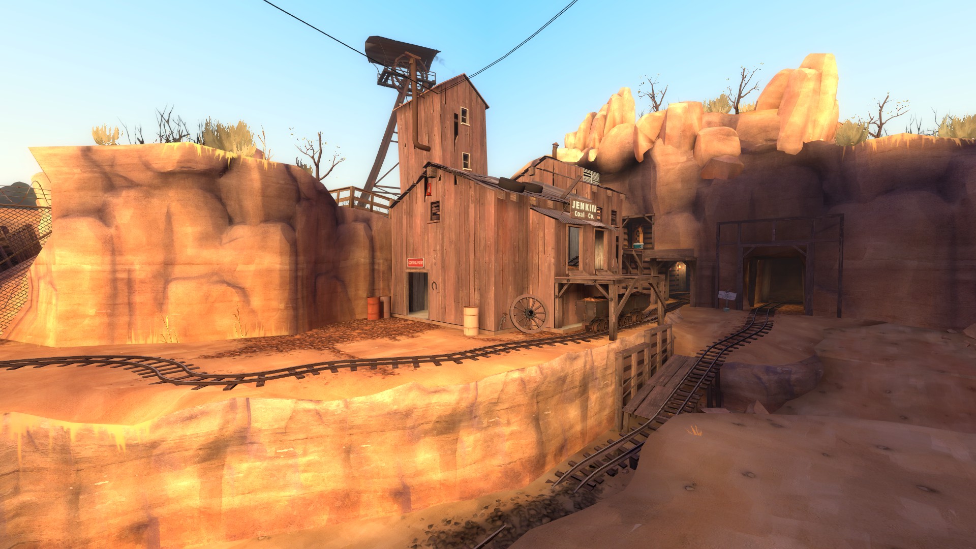
In the above screenshot, we can see that the capture point area is very brightly lit. This is done only with environment lighting (lighting cast from the skybox). Other areas, such as the far right path and the ditch (directly below and behind this picture) are left in shadow. It isn't pitch black, but it means that players focus their attention primarily at the point and the better lit paths. We can also see that the tunnels toward the second point on this stage are dimmer, but also relatively well lit. It creates a secondary objective in the mind of the player, a future goal.
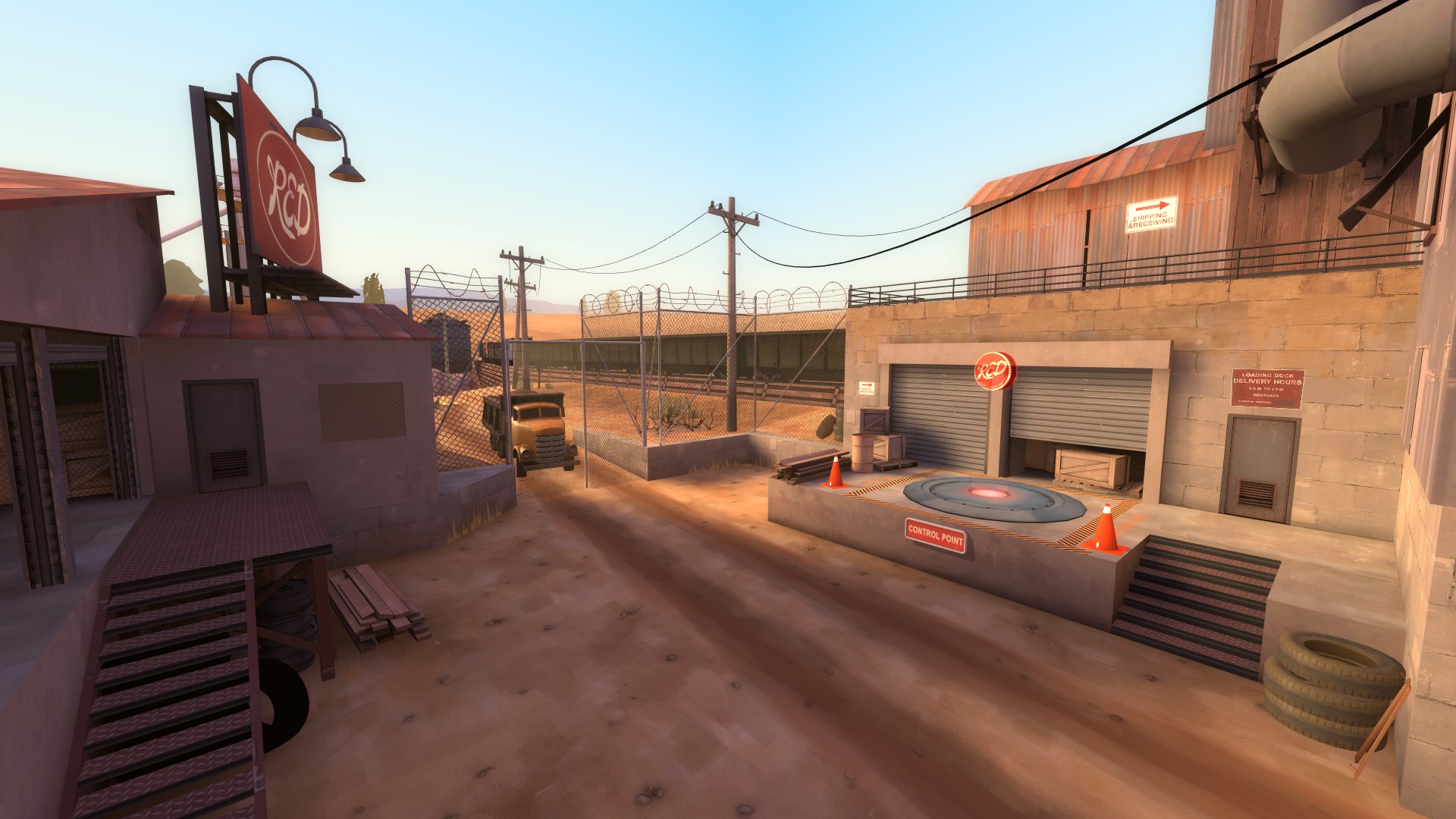
This is a similar example. Extraneous areas (the little hut between where BLU players emerge and the point) are left in shadow. Although light could be cast from the billboard, none is. Only directional environment lighting cues players to this area (besides the hologram, obviously). It's a great way to keep focus on one area.
I want to show you this idea on another map in kind of a different way.
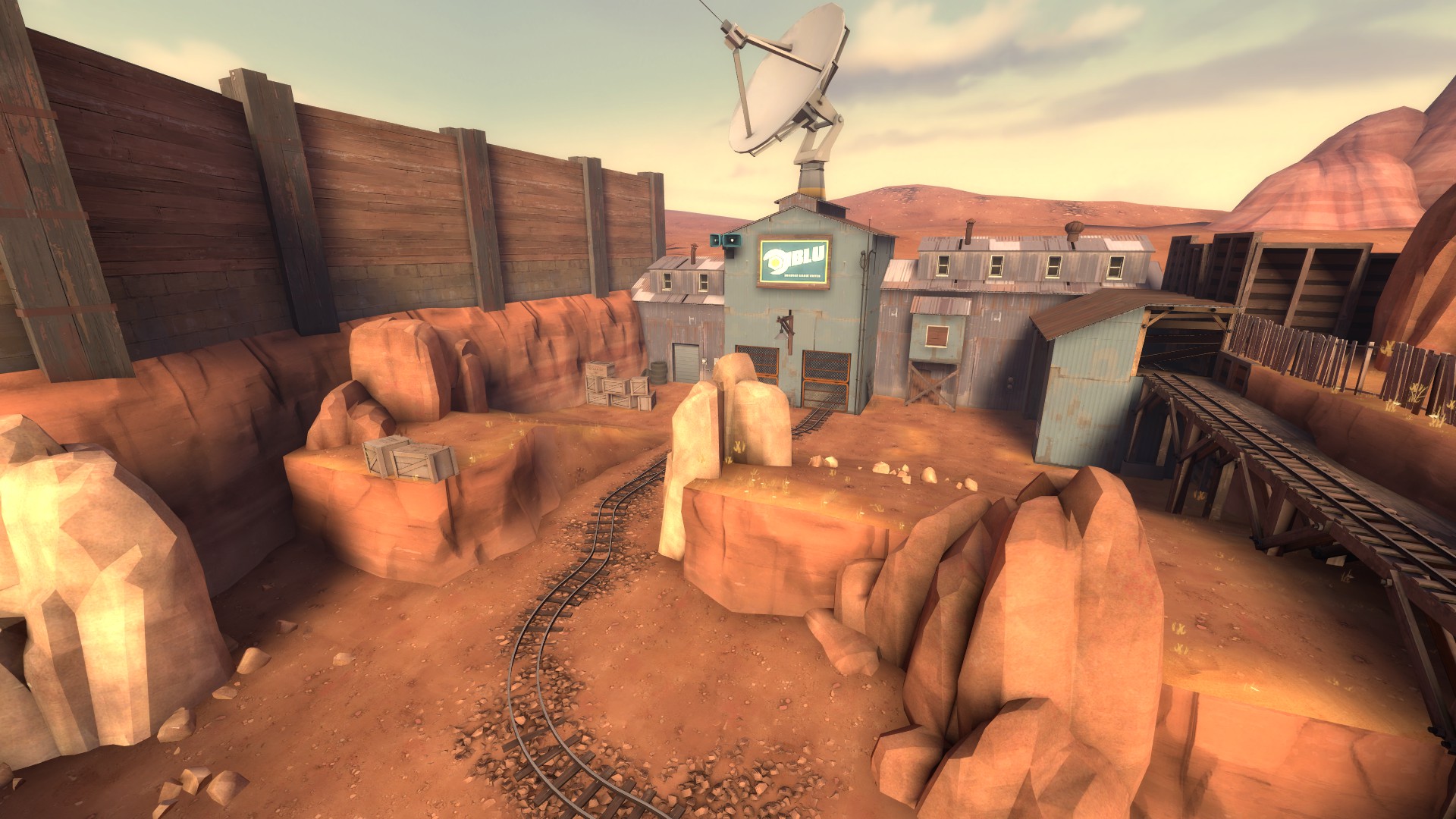
The BLU spawn here is completely lit by the sun. The BLU logo is even kind of overly bright, which is fine in moderation (more on this later).
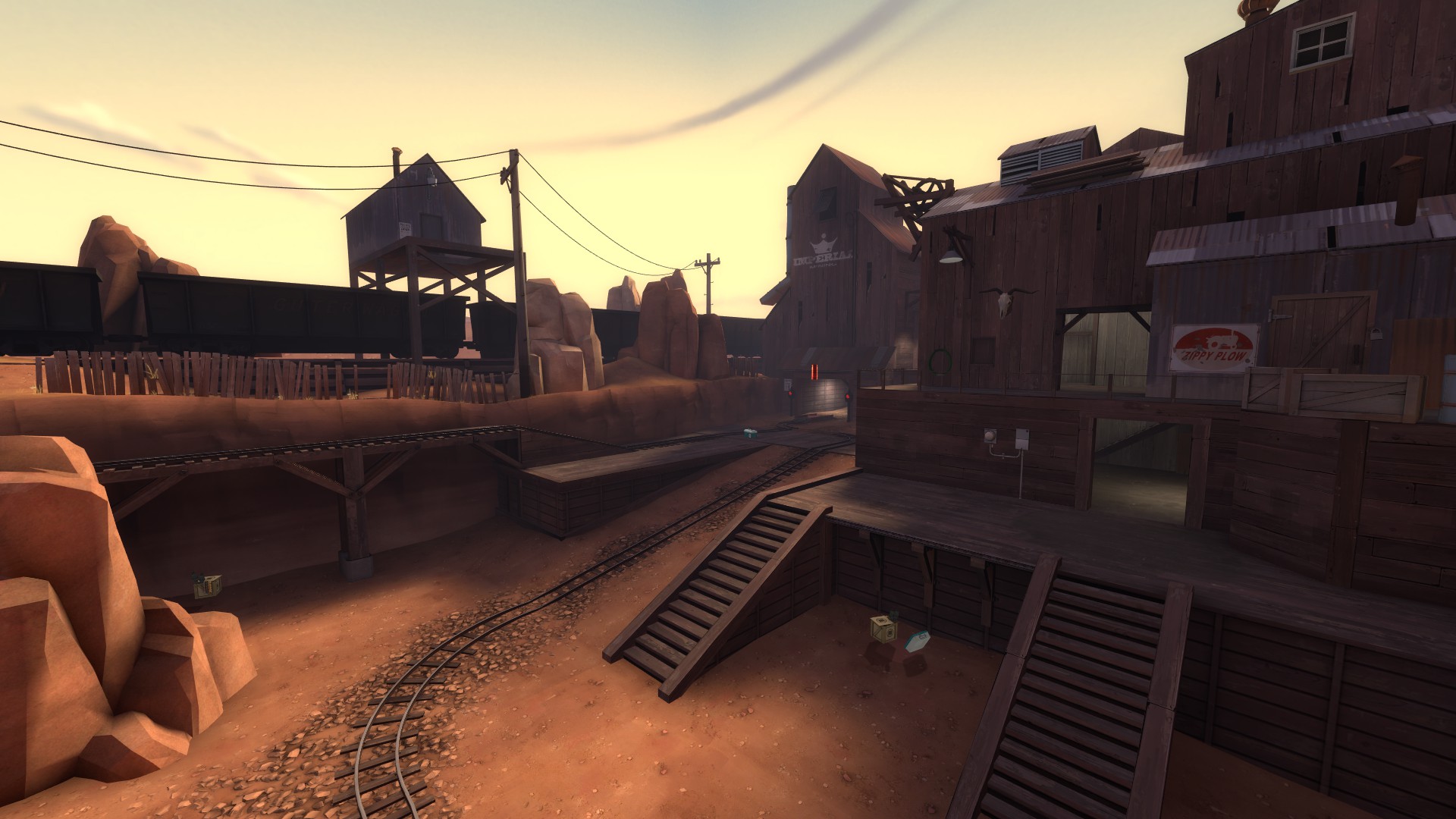
Players are led to this area, which is a lot darker than BLU spawn. So if lighting is so great for cues and direction, what's going on here? Why light BLU spawn, which you don't really need to return to once leaving, rather than the goal--in this case CP1? I would say it's a kind of foreshadowing (har har).
The RED facade here is dark, even though there are plenty of opportunities for lamps. Most of the bright areas are indoors, highlighting defensive holds. The brightest, whitest light is along the cart path, which still cues players towards an eventual goal. The overall dark facade sends a message: attacking this is hard.
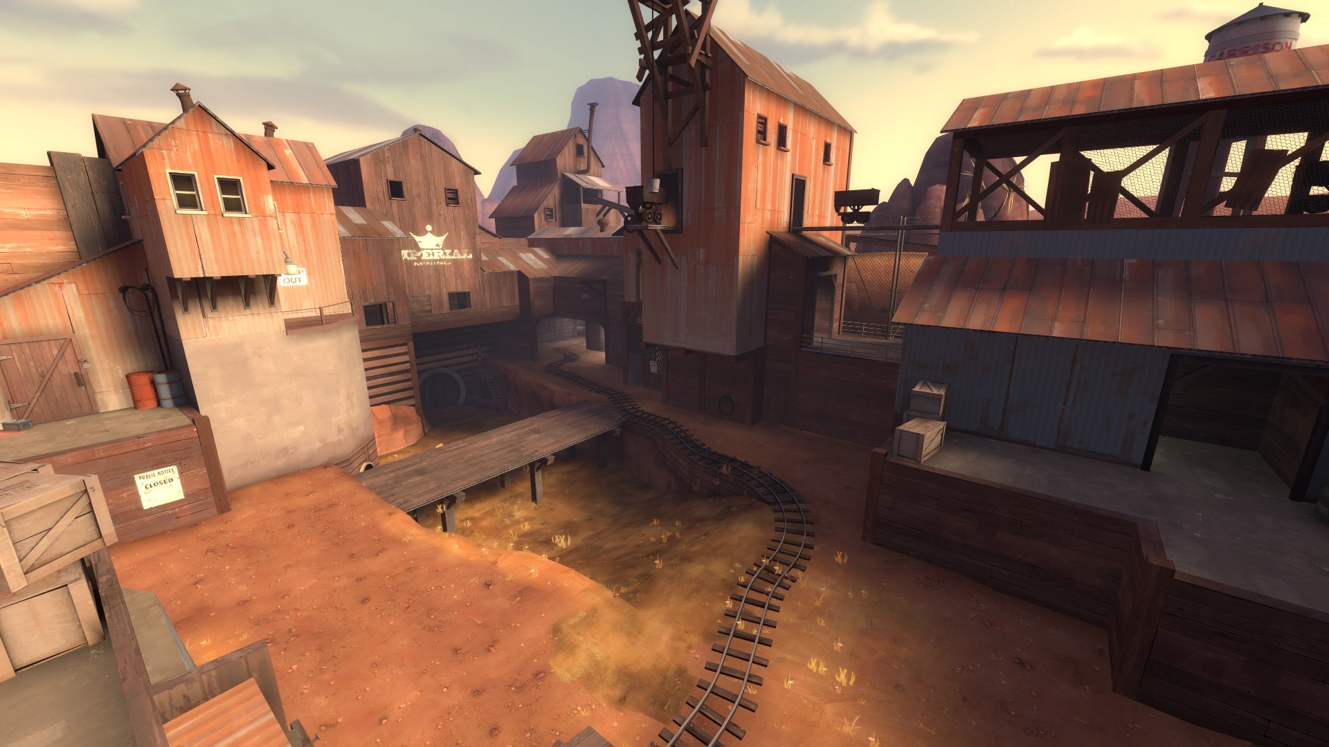
We see the same message again on the other side of the tunnel, but by this point the message is for RED, not BLU. Though there is plenty of opportunity to light the area, it's shadowed. Again, the light in the darker areas signify defensive holds (this time for BLU).
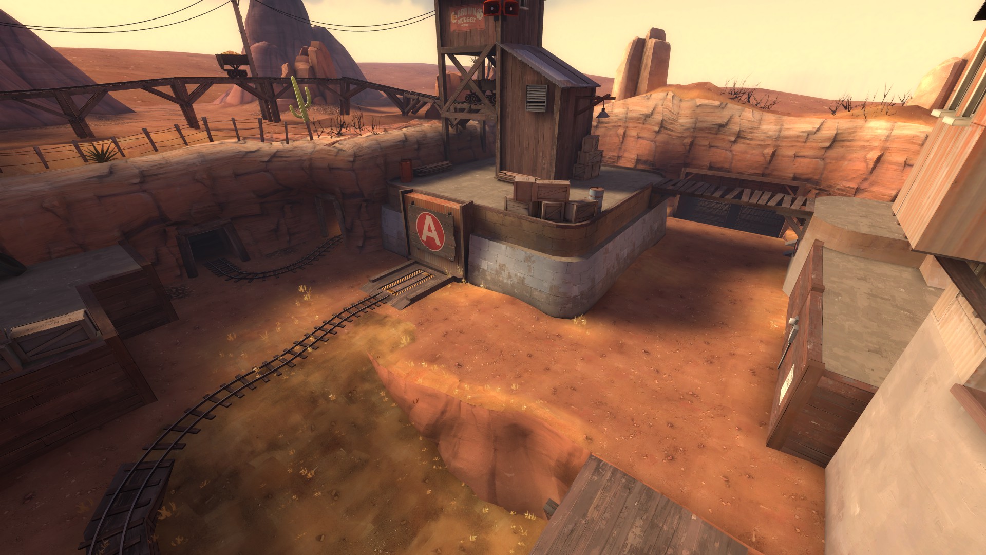
The final goal is bright and well lit, and the long flanking path on the left is dimmer to indicate a less used path. The gates used in stage 2 are left very dark. The lamp above the spawn is left off to better highlight the contrast between CP2 and other areas.
Taking this mind, it is important to remember that lighting isn't everything. Let's look at this screenshot of Upward.
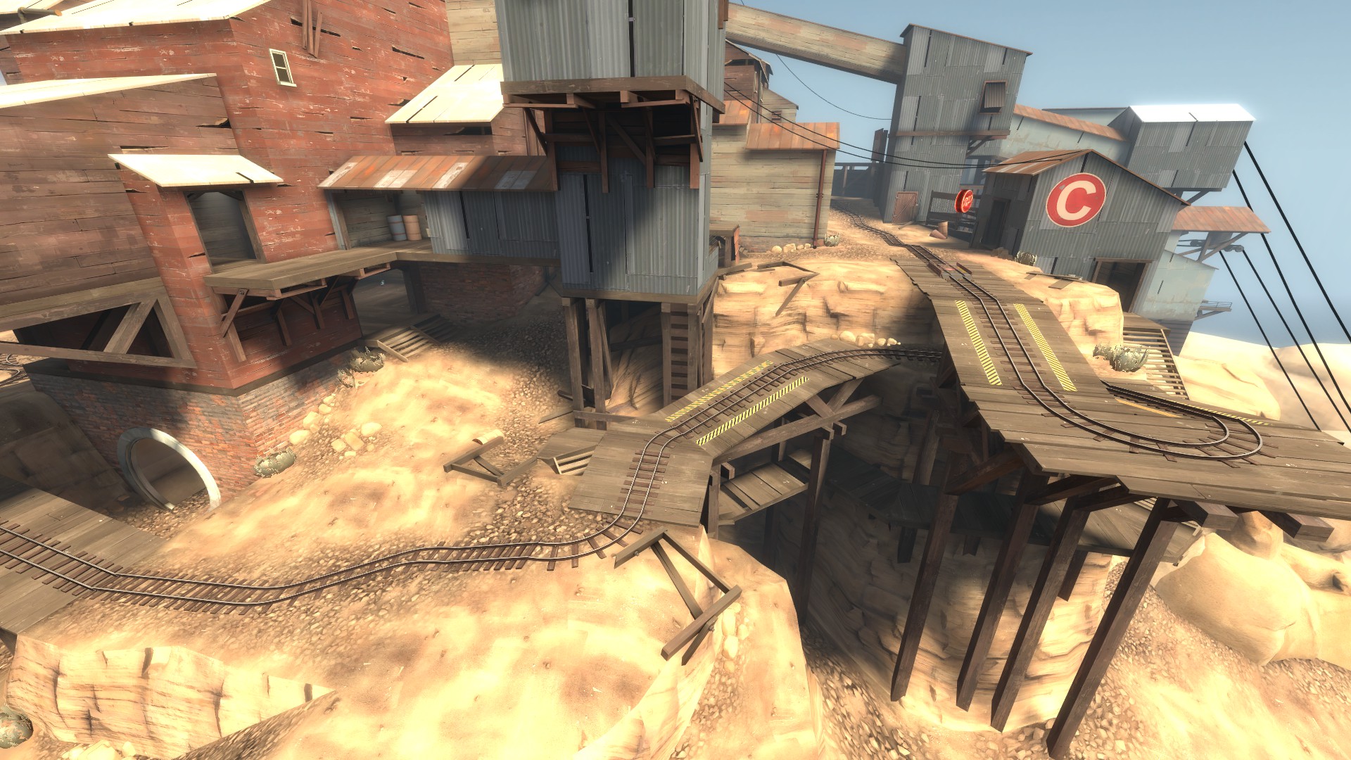
The area the cart goes through is very well lit (Upward has a very high environment lighting--if I remember right, it's 1000, maybe more). However, it's not the safest path and players must spend a long time on the turnaround to progress. It's very winding. Players will choose the darker paths (either under the blue building or under the cart path) more often as a means to better attack the enemy.
Lighting wise, Upward is a very interesting map. Let's talk about cues now.
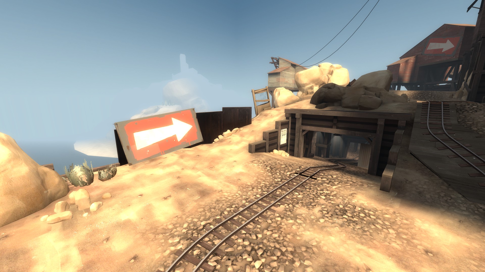
In this, both paths for RED to counterattack (the tunnel and above the tunnel) are mostly very dark. Like with Goldrush, this is a subconscious cue telling players it is hard to attack. However, because of the bright light reflecting off the arrow sign, players are still encouraged to go that way. It's an uphill battle or a fight into an easily guarded cave, but people still do it.
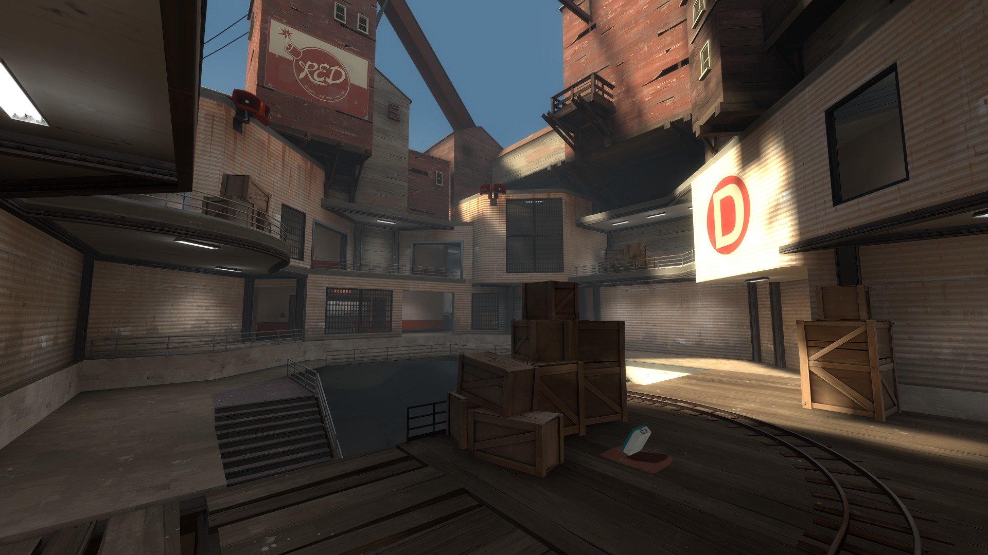
In this image, players entering the final area won't see the end of the track right away, but they will see the very bright D sign. The overall darkness compared to the rest of the map signifies an end: this is it.
Cues can be used in many ways.
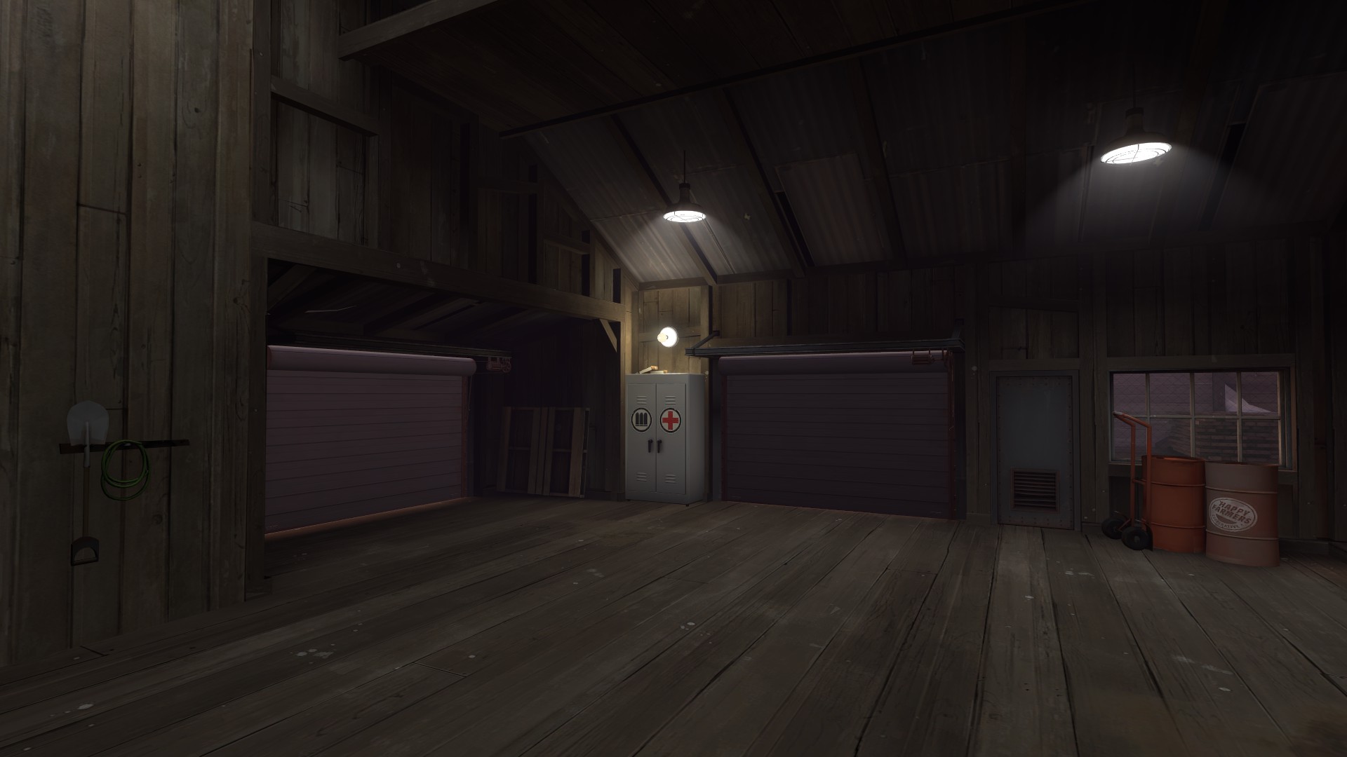
The single point of interest in a room.
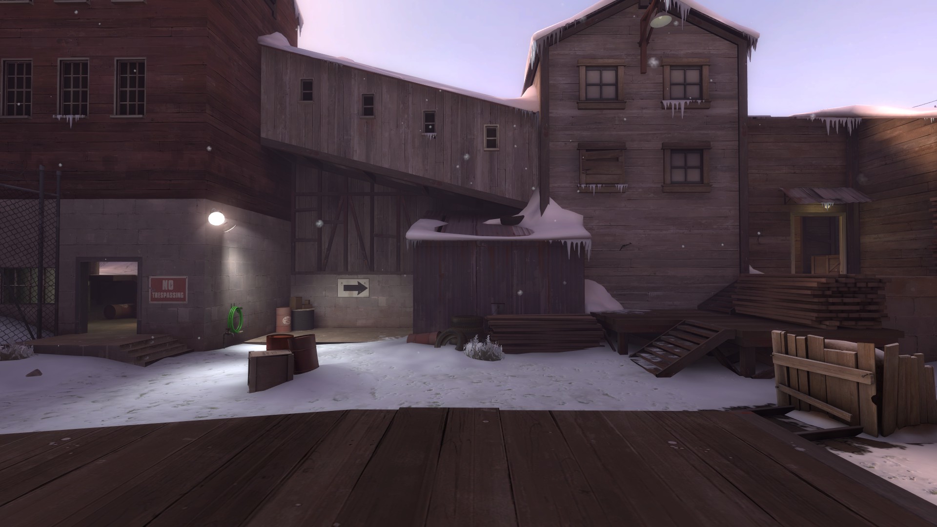
A route you may miss otherwise.
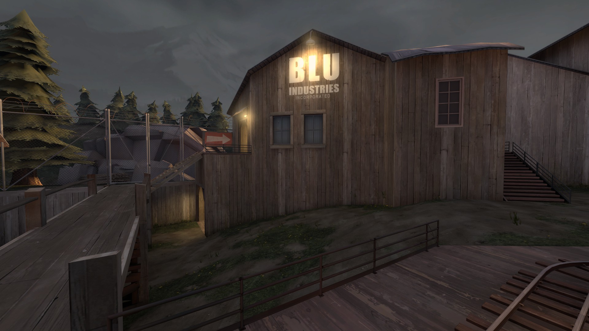
The entrances to an out of the way building (notice the light on the BLU overlay in RED territory, signifying a building BLU should own once they are in this area).
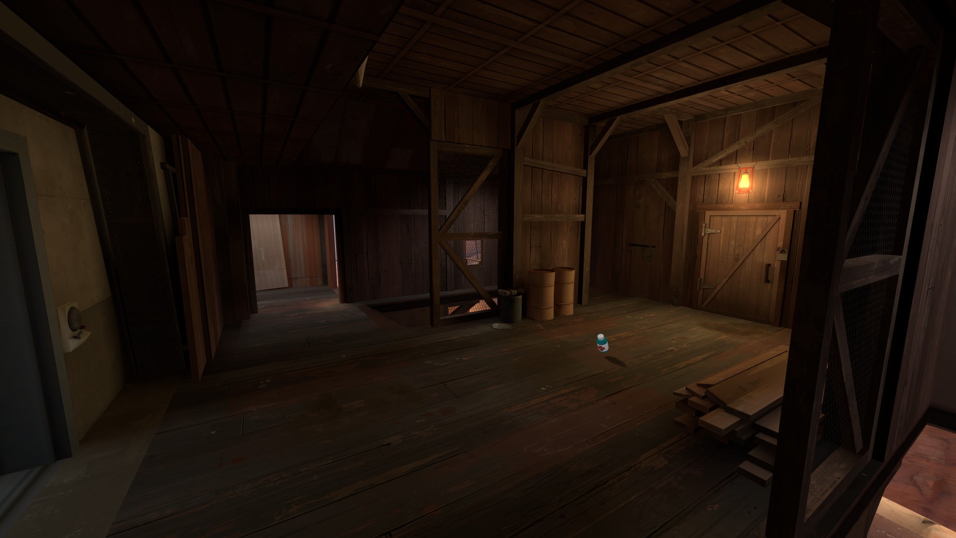
Pickups.
Making a cue is simple. You just have to think about it a little bit. Let's look at Dustbowl again.
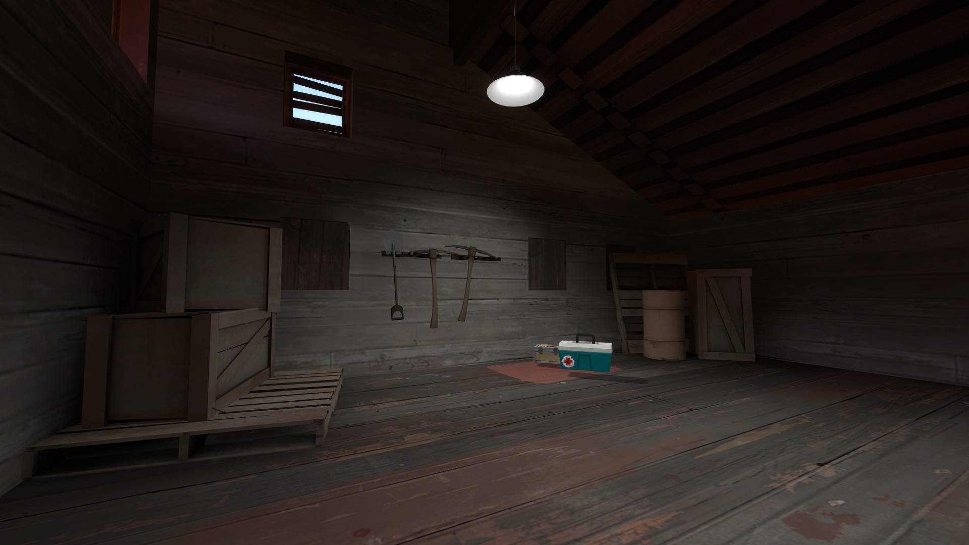
In this image we see a dark room often used by players. It could be lit any number of ways (ambient lighting from the window up top, lanterns, more ceiling lamps, etc), but instead the light focuses on the full health and full ammo.
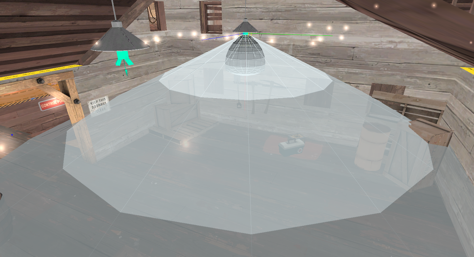
Valve has used a light cone with a 30 degree inner angle and a 65 degree outer angle, making the room somewhat lit with a bright center. They have foregone further lighting. The light is only at 400 brightness. I guarantee you when players run in this room they look for that health, every time.
Alright, let's talk about night maps.
I think night maps are great, but you have to do them right. I see a lot of great night maps and a lot of bad ones, and usually the easiest way to tell is the lighting. One of the biggest flaws I see is people not making their environment lighting bright enough. It's just night--not hell. It's not pitch black. Next time it's about midnight in whatever city you live in, walk outside and tell me if you can see. You probably can! This is what you're going for. Although night maps are darker than day maps, it's not an excuse to slack off on lighting. (People that live in rural areas: sorry, can't help you.)
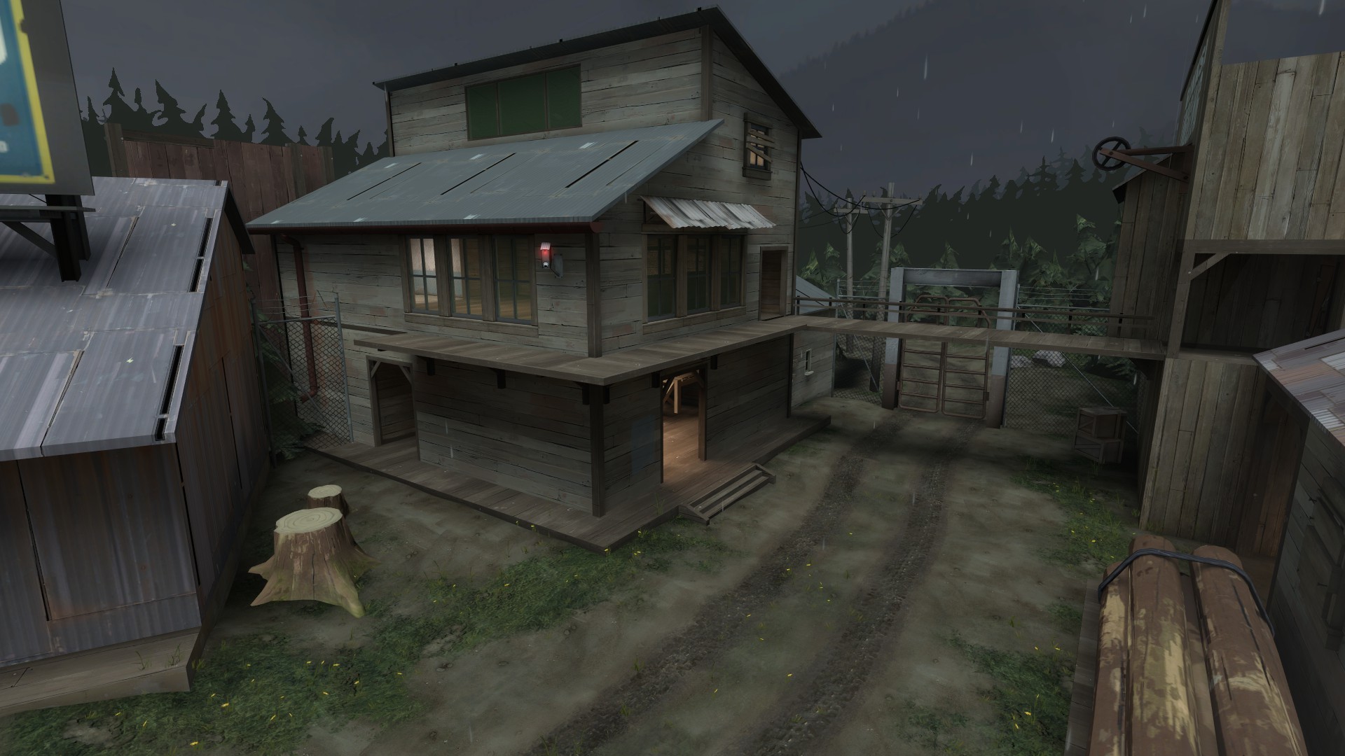
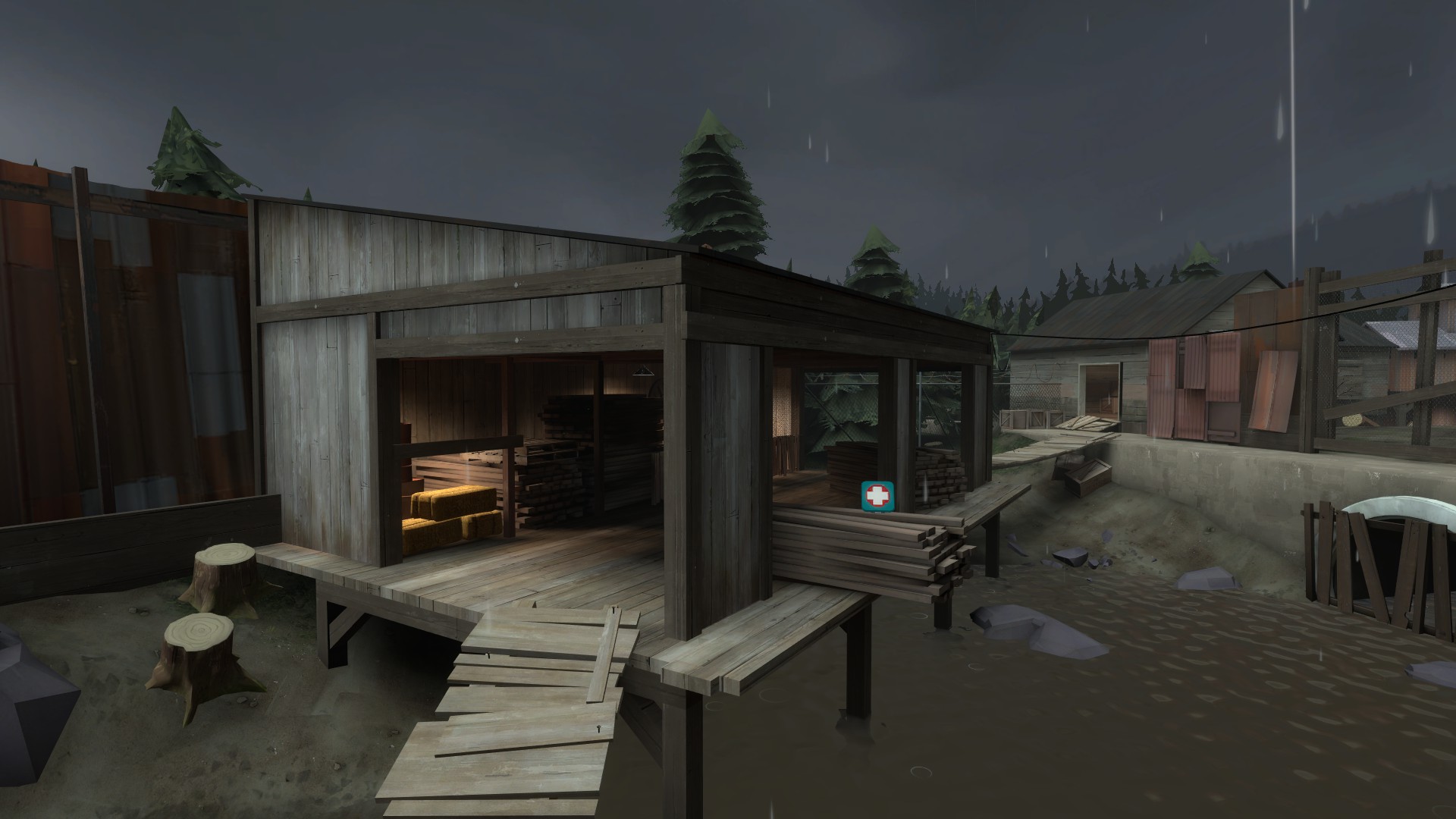
Examine these areas of Sawmill. All play areas are well lit and about as bright as the shadowy areas on regular day maps (though it's hard to tell because the contrast is so different). Bright lights are still used for cues and areas of importance, like spawn rooms, health, etc.
But maybe Sawmill isn't moody enough for you? Maybe you want something that is actually at midnight? Let's look at Pipeline.
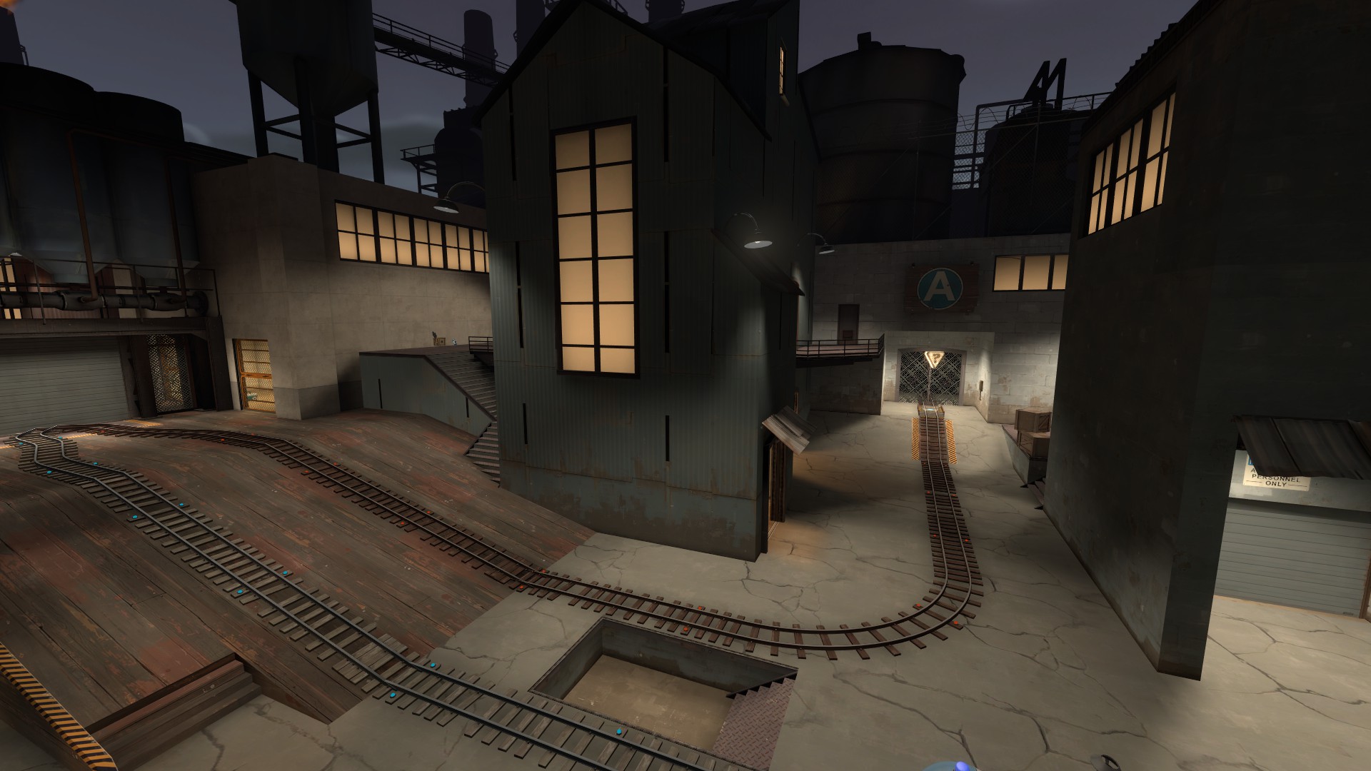
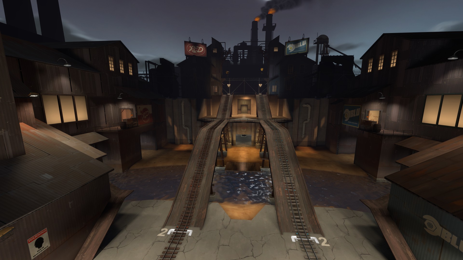
Wow, this is dark! Except for the play area, that is, which is bright. Anywhere players are likely to be is very well lit. Areas that players cannot reach are left very dark to set the overall mood without impacting gameplay. Remember when lighting your night map that a facility or farm or whatever will still be lit at night, and spies/snipers can still take advantage of darker areas the same way they would on a daytime map.
But let's look at how this is accomplished.
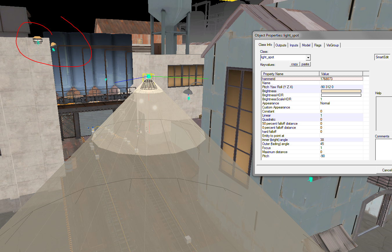
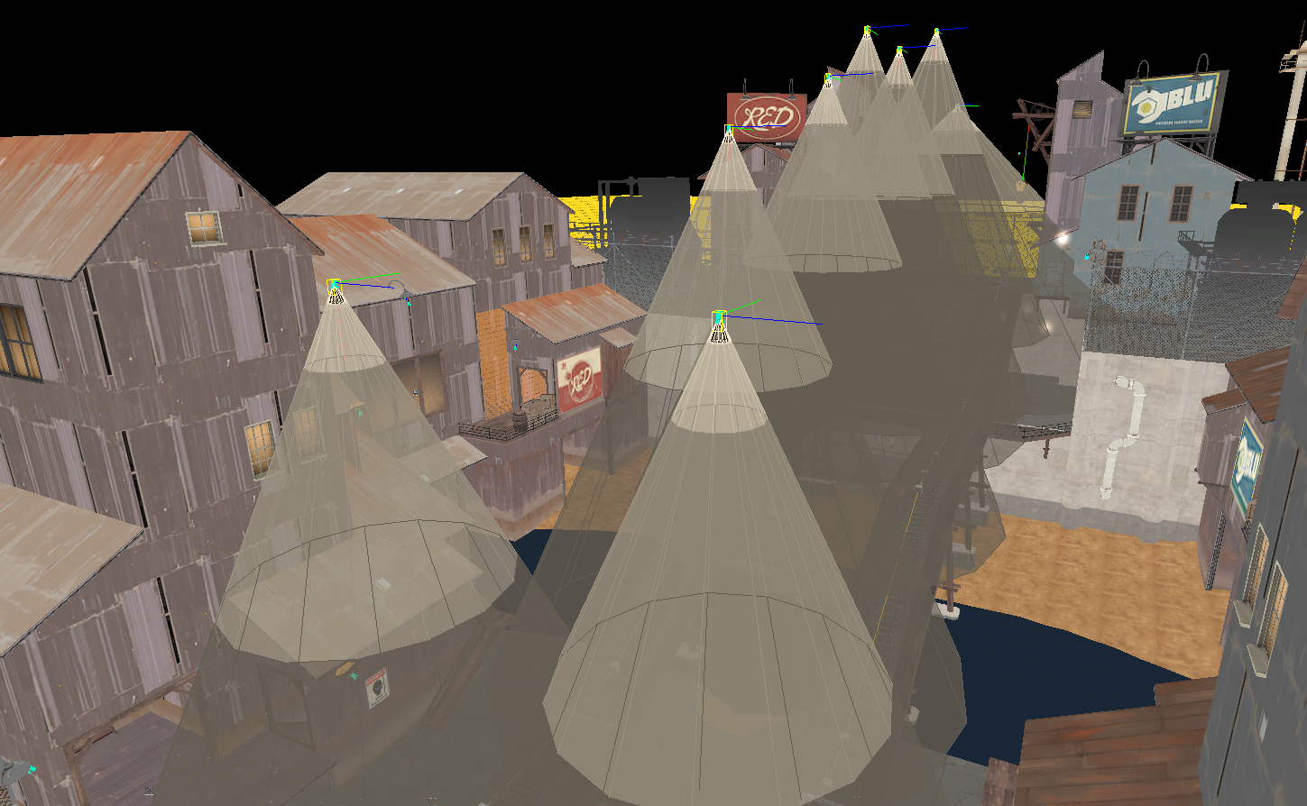
Pipeline uses lights placed at the top of buildings (circled in red) to create dramatic, top down lighting. The tight cones on the light_spots gives us the stark dark/light areas at the top/bottom of structures. Finally, pay close attention to the light I have selected. You'll notice that nothing is casting this light. This is something used in Pipeline and other night maps all the time, and in some day maps too. Players don't notice this at all. In this case the light matches the tone of the other lights in the area, but for maps with more of an outdoor focus, you can use a brighter version of your environment lighting's color as well.
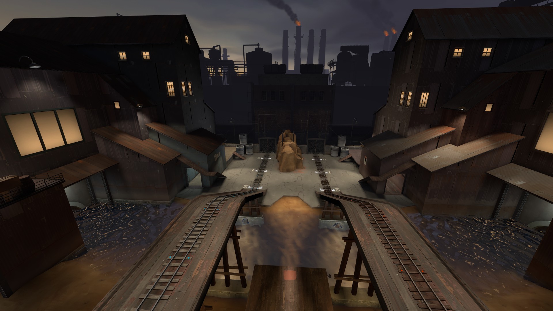
Here is another good example of what I just mentioned. Think all that light is natural?
It's not. Please, do not be afraid to make a night map bright. It's still a night map, and cues are still being used to highlight points of interest, but the main play areas--like we saw earlier in Dustbowl, Goldrush and Upward--are still the brightest lit areas of the map.
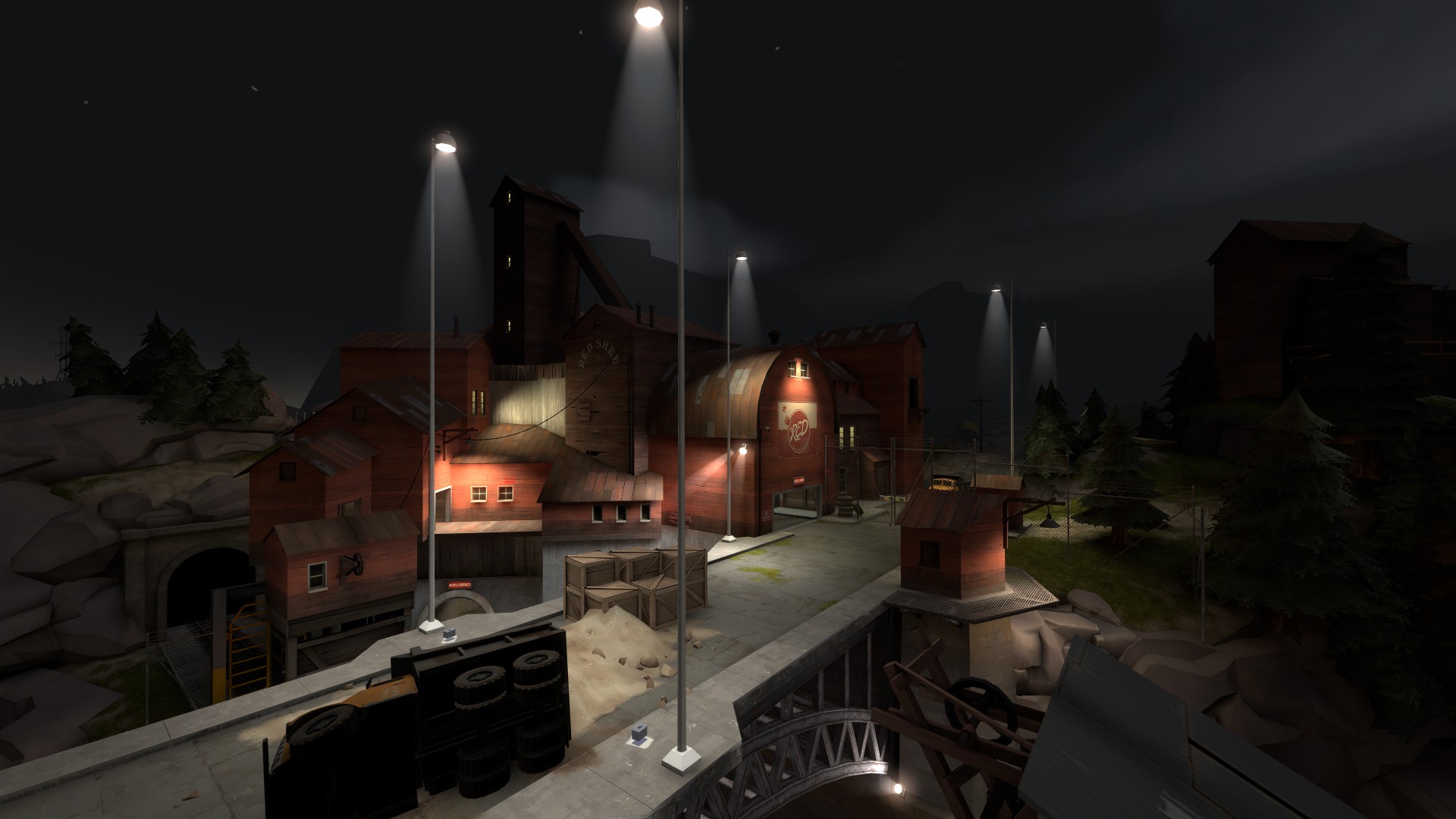
Study this image of Doublecross. What do you see? Out of bounds areas are unlit, play areas are very bright. Tall streetlights make the random, high up lighting more believable in this case--an ambient, strong light like in the first Pipeline example would be less believable on the bridge. Notice how all the areas players emerge from are also well defined.
Let's zoom in.
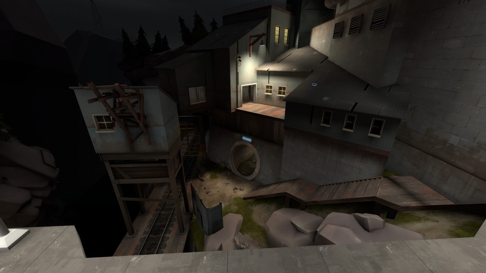
The stairs, sniper perch and sewers are all well lit, and the rest really isnt. What's the idea here? Ensuring gameplay will be clear and fun--not frustrating.
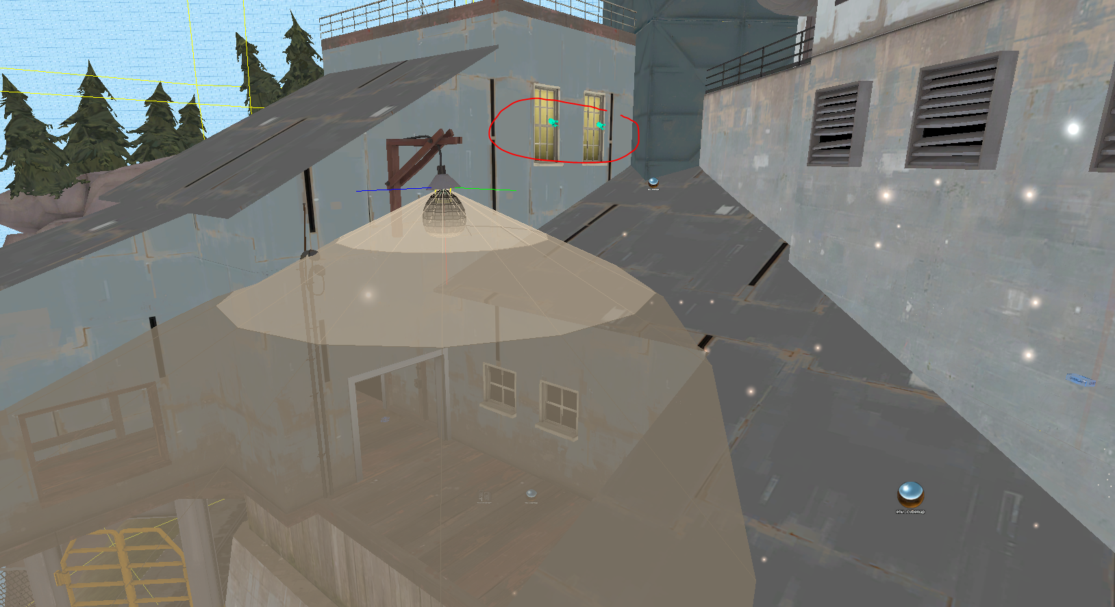
Not only is the lamp in this area casting light, but the windows are too. This is an underused trick, I think. It ensures that if a jump class gets on this roof, the players on the other team can know right away without being killed by someone that is effectively invisible.
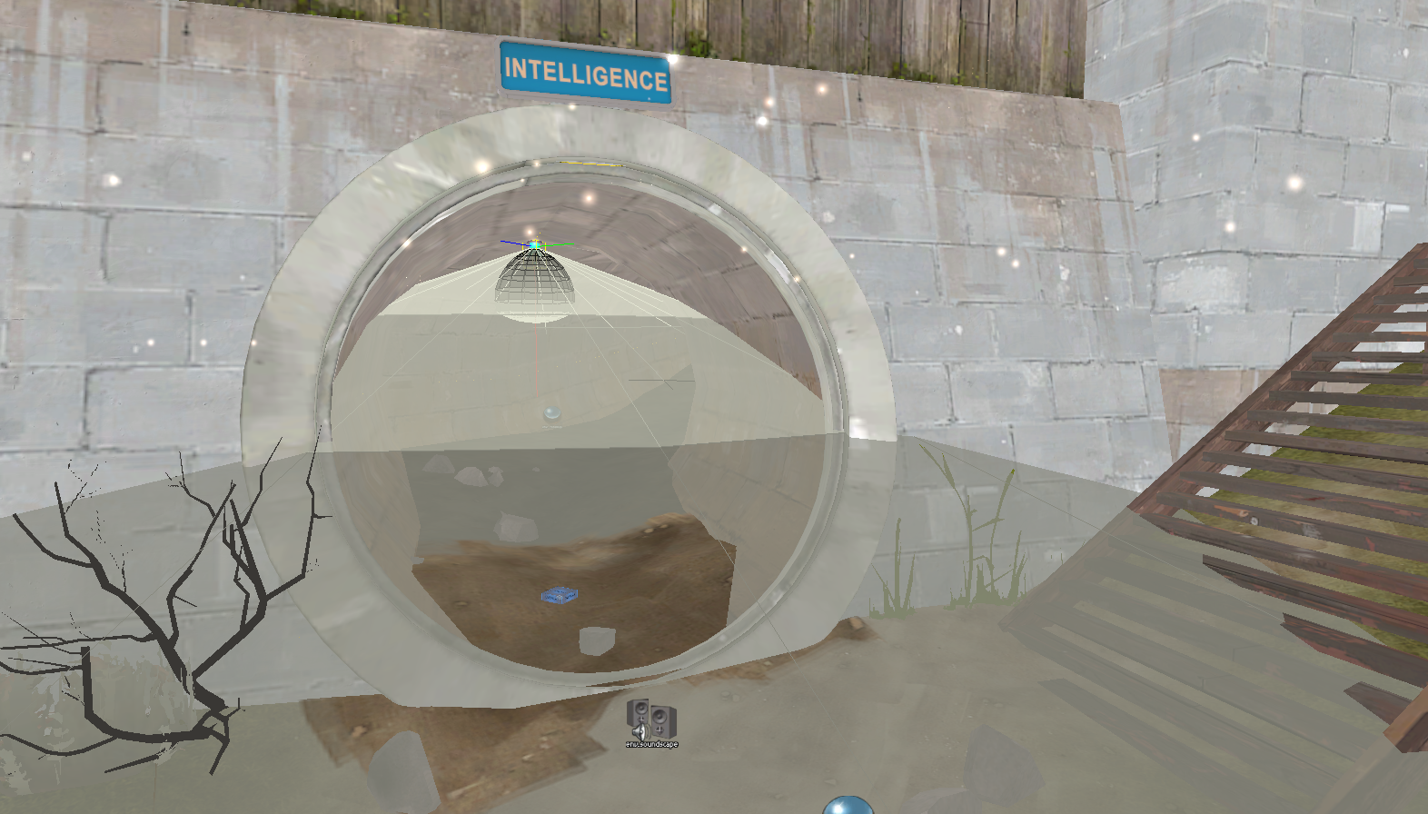
Since the sewers are a sneakier, more winding path into the base, the light coming from them is a bit darker. In this image, though the light is bright and strong, it's set back a ways into the tunnel. This keeps it more subtle and tells players this is a sneaky path.
But it's not only night maps that might need phantom lighting or lighting help.
Finally, let's look at my own map, Desertion. Now, I'm not the king of lighting my own maps--I'll admit I frequently just copy existing lights and use those most the time, until I reach late stages in development when I fine tune them. For Desertion, I copied most the lights from Upward.
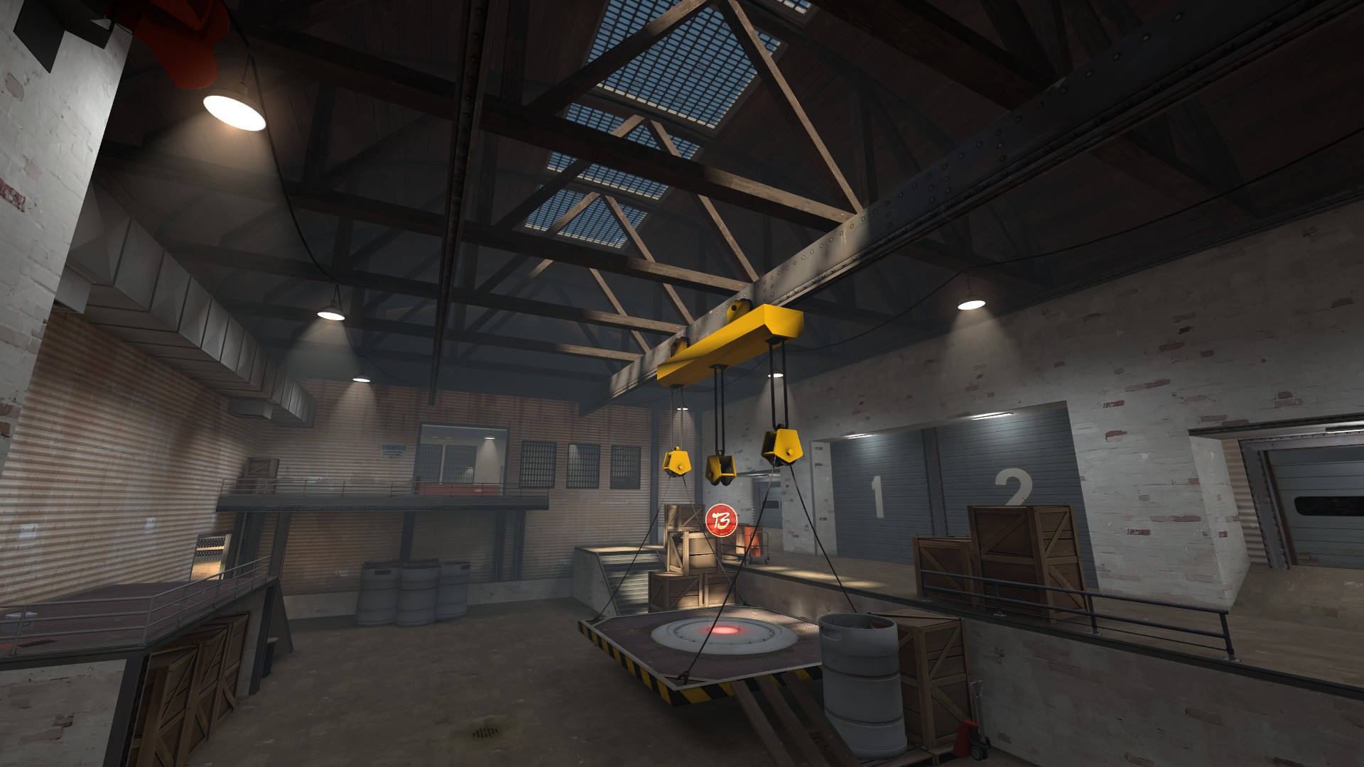
This is a shot from a late beta. It's definitely well lit and objectives are clear, but even the fine tuned lights I took from Upward weren't really doing enough.
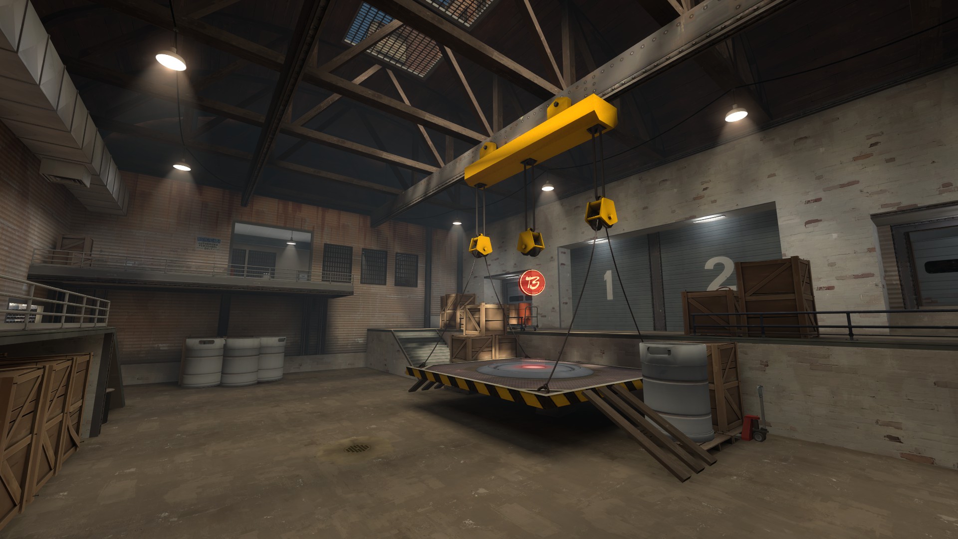
This is the same image (from a slightly different perspective). All I've done is add light_spots under the skylight with a low intensity and wide cones. The entire room is brighter, warmer, more interesting looking, and more fun to play in (har har). I haven't adjusted fog or anything else. Pretty amazing, right?
That's pretty much it. As a summary, let me remind you: your map should be bright, well lit, and cue players towards objectives, pickups, or alternate routes. Night maps are no exception--it's still dead simple to set the mood while retaining a playable map. And finally, don't be afraid to try going brighter or using phantom lights to help out certain areas--players will not notice in game and in every case I've ever tried it, it's helped immensely.
Edit: After a few responses I created an addendum to this post. Scroll down or click here to read it.
I hope this helps!
Something I missed or should make more clear? Let me know and I'll work it in.
Lighting is very important in your map. I would say it affects probably every aspect of your map, from mood to playability to how well it is received among the general public. Lighting is a big deal and is not to be taken lightly (har har). Light leads players to points of interest (capture points, health, alternate routes). Brighter light makes identifying other players or items easier.
Let's look at some pictures of Dustbowl.
In the above screenshot, we can see that the capture point area is very brightly lit. This is done only with environment lighting (lighting cast from the skybox). Other areas, such as the far right path and the ditch (directly below and behind this picture) are left in shadow. It isn't pitch black, but it means that players focus their attention primarily at the point and the better lit paths. We can also see that the tunnels toward the second point on this stage are dimmer, but also relatively well lit. It creates a secondary objective in the mind of the player, a future goal.
This is a similar example. Extraneous areas (the little hut between where BLU players emerge and the point) are left in shadow. Although light could be cast from the billboard, none is. Only directional environment lighting cues players to this area (besides the hologram, obviously). It's a great way to keep focus on one area.
I want to show you this idea on another map in kind of a different way.
The BLU spawn here is completely lit by the sun. The BLU logo is even kind of overly bright, which is fine in moderation (more on this later).
Players are led to this area, which is a lot darker than BLU spawn. So if lighting is so great for cues and direction, what's going on here? Why light BLU spawn, which you don't really need to return to once leaving, rather than the goal--in this case CP1? I would say it's a kind of foreshadowing (har har).
The RED facade here is dark, even though there are plenty of opportunities for lamps. Most of the bright areas are indoors, highlighting defensive holds. The brightest, whitest light is along the cart path, which still cues players towards an eventual goal. The overall dark facade sends a message: attacking this is hard.
We see the same message again on the other side of the tunnel, but by this point the message is for RED, not BLU. Though there is plenty of opportunity to light the area, it's shadowed. Again, the light in the darker areas signify defensive holds (this time for BLU).
The final goal is bright and well lit, and the long flanking path on the left is dimmer to indicate a less used path. The gates used in stage 2 are left very dark. The lamp above the spawn is left off to better highlight the contrast between CP2 and other areas.
Taking this mind, it is important to remember that lighting isn't everything. Let's look at this screenshot of Upward.
The area the cart goes through is very well lit (Upward has a very high environment lighting--if I remember right, it's 1000, maybe more). However, it's not the safest path and players must spend a long time on the turnaround to progress. It's very winding. Players will choose the darker paths (either under the blue building or under the cart path) more often as a means to better attack the enemy.
Lighting wise, Upward is a very interesting map. Let's talk about cues now.
In this, both paths for RED to counterattack (the tunnel and above the tunnel) are mostly very dark. Like with Goldrush, this is a subconscious cue telling players it is hard to attack. However, because of the bright light reflecting off the arrow sign, players are still encouraged to go that way. It's an uphill battle or a fight into an easily guarded cave, but people still do it.
In this image, players entering the final area won't see the end of the track right away, but they will see the very bright D sign. The overall darkness compared to the rest of the map signifies an end: this is it.
Cues can be used in many ways.
The single point of interest in a room.
A route you may miss otherwise.
The entrances to an out of the way building (notice the light on the BLU overlay in RED territory, signifying a building BLU should own once they are in this area).
Pickups.
Making a cue is simple. You just have to think about it a little bit. Let's look at Dustbowl again.
In this image we see a dark room often used by players. It could be lit any number of ways (ambient lighting from the window up top, lanterns, more ceiling lamps, etc), but instead the light focuses on the full health and full ammo.
Valve has used a light cone with a 30 degree inner angle and a 65 degree outer angle, making the room somewhat lit with a bright center. They have foregone further lighting. The light is only at 400 brightness. I guarantee you when players run in this room they look for that health, every time.
Alright, let's talk about night maps.
I think night maps are great, but you have to do them right. I see a lot of great night maps and a lot of bad ones, and usually the easiest way to tell is the lighting. One of the biggest flaws I see is people not making their environment lighting bright enough. It's just night--not hell. It's not pitch black. Next time it's about midnight in whatever city you live in, walk outside and tell me if you can see. You probably can! This is what you're going for. Although night maps are darker than day maps, it's not an excuse to slack off on lighting. (People that live in rural areas: sorry, can't help you.)
Examine these areas of Sawmill. All play areas are well lit and about as bright as the shadowy areas on regular day maps (though it's hard to tell because the contrast is so different). Bright lights are still used for cues and areas of importance, like spawn rooms, health, etc.
But maybe Sawmill isn't moody enough for you? Maybe you want something that is actually at midnight? Let's look at Pipeline.
Wow, this is dark! Except for the play area, that is, which is bright. Anywhere players are likely to be is very well lit. Areas that players cannot reach are left very dark to set the overall mood without impacting gameplay. Remember when lighting your night map that a facility or farm or whatever will still be lit at night, and spies/snipers can still take advantage of darker areas the same way they would on a daytime map.
But let's look at how this is accomplished.
Pipeline uses lights placed at the top of buildings (circled in red) to create dramatic, top down lighting. The tight cones on the light_spots gives us the stark dark/light areas at the top/bottom of structures. Finally, pay close attention to the light I have selected. You'll notice that nothing is casting this light. This is something used in Pipeline and other night maps all the time, and in some day maps too. Players don't notice this at all. In this case the light matches the tone of the other lights in the area, but for maps with more of an outdoor focus, you can use a brighter version of your environment lighting's color as well.
Here is another good example of what I just mentioned. Think all that light is natural?
It's not. Please, do not be afraid to make a night map bright. It's still a night map, and cues are still being used to highlight points of interest, but the main play areas--like we saw earlier in Dustbowl, Goldrush and Upward--are still the brightest lit areas of the map.
Study this image of Doublecross. What do you see? Out of bounds areas are unlit, play areas are very bright. Tall streetlights make the random, high up lighting more believable in this case--an ambient, strong light like in the first Pipeline example would be less believable on the bridge. Notice how all the areas players emerge from are also well defined.
Let's zoom in.
The stairs, sniper perch and sewers are all well lit, and the rest really isnt. What's the idea here? Ensuring gameplay will be clear and fun--not frustrating.
Not only is the lamp in this area casting light, but the windows are too. This is an underused trick, I think. It ensures that if a jump class gets on this roof, the players on the other team can know right away without being killed by someone that is effectively invisible.
Since the sewers are a sneakier, more winding path into the base, the light coming from them is a bit darker. In this image, though the light is bright and strong, it's set back a ways into the tunnel. This keeps it more subtle and tells players this is a sneaky path.
But it's not only night maps that might need phantom lighting or lighting help.
Finally, let's look at my own map, Desertion. Now, I'm not the king of lighting my own maps--I'll admit I frequently just copy existing lights and use those most the time, until I reach late stages in development when I fine tune them. For Desertion, I copied most the lights from Upward.
This is a shot from a late beta. It's definitely well lit and objectives are clear, but even the fine tuned lights I took from Upward weren't really doing enough.
This is the same image (from a slightly different perspective). All I've done is add light_spots under the skylight with a low intensity and wide cones. The entire room is brighter, warmer, more interesting looking, and more fun to play in (har har). I haven't adjusted fog or anything else. Pretty amazing, right?
That's pretty much it. As a summary, let me remind you: your map should be bright, well lit, and cue players towards objectives, pickups, or alternate routes. Night maps are no exception--it's still dead simple to set the mood while retaining a playable map. And finally, don't be afraid to try going brighter or using phantom lights to help out certain areas--players will not notice in game and in every case I've ever tried it, it's helped immensely.
Edit: After a few responses I created an addendum to this post. Scroll down or click here to read it.
I hope this helps!
Something I missed or should make more clear? Let me know and I'll work it in.
Last edited by a moderator:


